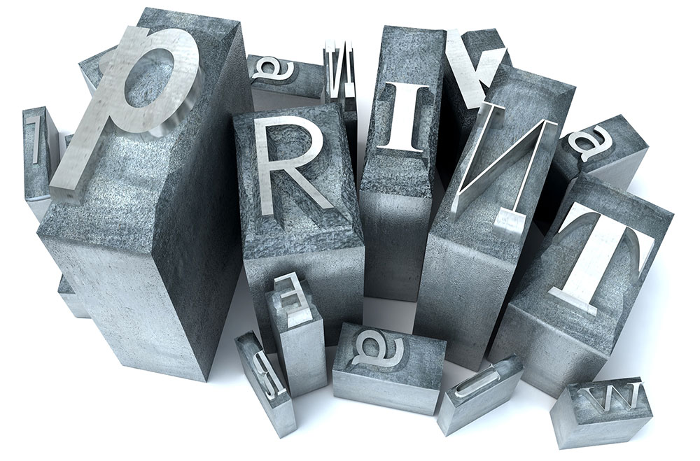
Here at Miklis, we want you to look good on paper, and your font choices are a critical part of getting that job done right.
Oftentimes companies and organizations will create a brand kit which contains two-to-three fonts they’ll use almost exclusively for headings and text. Limiting your fonts builds consistency and increases recognition with your audience and customers.
1. Serif versus Sans-Serif Fonts
Serif fonts like Times New Roman and Garamond contain little “feet” or hooks at the end of the letters. Sans-serif fonts like Arial and Comic Sans do not. Each type of font has better readability depending on the medium. For online or eBooks, sans-serif is easier to read, but for printed work, the difference between the two is negligible. This allows you a full range of options for your brochures, flyers, and newsletters.To create a balanced look, choose a font in the sans-serif category (such as Trebuchet) for your heading and a serif font like Palatino for the body of your text. Avoid using a sans-serif font for both the heading and the body, as the final product might lack the contrast needed to differentiate the heading from the body. Another option for your heading would be a scripted font.
2. Script versus Non-Script Fonts
Decorative fonts add elegance and emphasis to your work. Scripted fonts are difficult to read in large doses, so utilize script strategically. Similar to how sans-serif fonts work better online, scripted fonts can cause problems if the recipient does not have the same fonts downloaded. However, when your work is printed, you have the full spectrum of options to choose from. A well-chosen scripted font speaks volumes about your brand. You can also have fun with fonts, especially for holiday and event advertising. There are several themed fonts that will exude fun and whimsy. Choose your favorite, but use them sparingly. As mentioned above, non-script fonts are easier on the eyes, so choose your favorite serif font to coordinate with your scripted header.
3. Free versus Licensed Fonts
Not every font is available for public use, especially in commercial instances. For example, Disney’s font is unique, inspired by Walt Disney’s signature. It’s a classic font that we instantly recognize for the company that is the most magical place on earth. Because it is highly recognizable, this is a font that may hurt your brand image instead of help.For the most part, the majority of font typefaces for commercial use require the purchase of a license. There are a variety of different restrictions, so be sure to read the terms carefully before purchasing a license. Some agreements allow up to “x” number of copies sold before you have to pay an additional licensing fee. Also watch out for where you can use the font. The owner may only allow the font to be used commercially online, or restrict the font from being installed on anyone else’s machines.
There are several places to find free fonts online, including dafont.com and fontspace.com. While these fonts are free to use personally, be sure to follow the designer’s licensing option when using the font commercially.
We hope these tips and suggestions help bring creativity and polish to your project. At Miklis, we are here to partner with you so that you can spread your mission and message with beautiful design.

