Wisely chosen colors communicate who you are
as a brand and a company. “A study from the University of Toronto…revealed most people preferred simple color combinations that relied on only 2 to 3 favorite colors” (Hauff, 2016). It is not only your logo and text that communicates in your marketing materials—color also communicates who you are as a brand. Complementary colors are opposite of each other on the color wheel, but interestingly, red and green, which are complimentary, “are a common problematic combination for people who have some color blindness… Facebook is blue because Mark Zuckerberg is red-green colorblind? He sees blues the best” (Hauff, 2016).
Interestingly, blues and greens have a calming effect, while blue is more business-like and greens convey instruction and nature (Widrich, 2015). Research from Kissmetrics.com shows that both women and men like blues and greens, while women prefer purple and dislike browns and grays. Contrastingly, black is on the top list for men and brown, orange, and purple fall on their least favorite list.
Know Your Number
There are many tints, shades, and tones of the same color, so knowing your brand’s hex codes is important. A hex code is six alphanumeric combination that refers to an exact shade on the color spectrum. It’s crucial to know what your color hex codes to ensure consistency in your branding.
Colors will appear differently on computer monitors, depending on the user’s brightness and color levels on their individual computer. But on paper, it’s vital that your business cards, brochures, signs, and materials are all exactly the same shade.
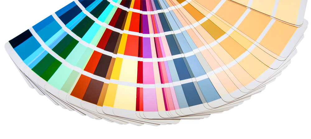
A popular system of color standardization to ensure that your colors are consistent is the Pantone Matching System (PMS), which allows you to see what your color will look like on different types of paper. Interestingly, the same shade of red on matte paper can appear differently on coated or uncoated paper.
The Pantone system has different numbering than a hex code for colors. You can find your perfect Pantone color by using their color finder on their website.
For those who want to elevate their color process, we suggest purchasing your own set of PMS color reference books because—when it comes to print—no on-screen representation of color matching can compare to real paper for the more discerning client.
Contrast
When choosing your color scheme, think about tone, shade, and tint, which are achieved by adding white, black, or a combination of white and black to your color. Be sure that your chosen colors have a high contrast to make your work easy to read and understand. If your materials get printed in black and white, will your customer be able to clearly read or identify your content?
To test this, print a sheet in grayscale. If your colors have the same tone, the contrast will be low and you may want to adjust your color scheme. This is especially important when it comes to the color of your text. Since it is easy to read dark text on a light background, make it simple for your customers to consume your content.
Trademarks
Colors may be trademarked for specific items. Iconic brands such as Tiffany, Home Depot, and Post-Its are among a list of companies that have trademarked their colors, and John Deere trademarked their iconic green and yellow. The trademark on the colors only exists to protect a brand from their competition, so even though Target owns their hue of red, “Coca-Cola, which shares the bright fire engine red, is safe—the brands aren’t direct competitors” (Innis, 2016).
Here at Miklis, we care about how your projects communicate your brand to your customers. If you have any questions about color scheme or design, our team is here to help. We are your partner in print and will ensure that you look good on paper.
References
Hauff, A. (2016, April 8). The know it all guide to color psychology in marketing + The best hex chart. CoSchedule Blog. Retrieved from https://coschedule.com/blog/color-psychology-marketing/
Innis, E. (2016, May 17). 9 brands that have trademarked a color. Shutterstock blog. Retreived from https://www.shutterstock.com/blog/9-brands-trademarked-color.
Kissmetrics.com. How colors affect conversions. Retrieved from https://blog.kissmetrics.com/how-colors-affect-conversions/?wide=1.
Widrich, L. (2015, April 25). Why Facebook is blue: the science of colors in marketing. Online Marketing. Buffer Social. Retrieved from https://blog.bufferapp.com/the-science-of-colors-in-marketing-why-is-facebook-blue