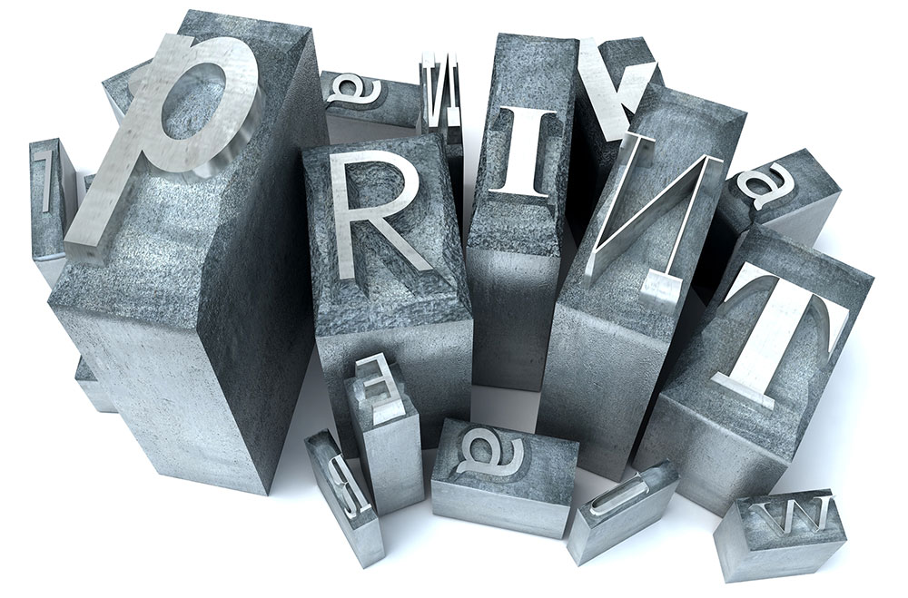
Here at Miklis, we want you to look good on paper, and your font choices are a critical part of getting that job done right. Oftentimes companies and organizations will create a brand kit which contains two-to-three fonts they’ll use almost exclusively for headings and text. Limiting your fonts builds consistency and increases recognition with your audience and customers. 1. Serif versus Sans-Serif Fonts Serif fonts like Times New Roman and Garamond contain little “feet” or hooks at the end of the letters. Sans-serif fonts like Arial and Comic Sans do not. Each type of font has better readability depending on the medium. For online or eBooks, sans-serif is easier to read, but for printed work, the difference between the…

Recent Comments