Category

Design

Do’s and Don’ts When Choosing Color for Your Marketing Materials

By Design, Marketing

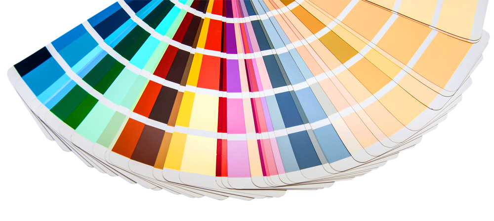
Wisely chosen colors communicate who you are as a brand and a company. “A study from the University of Toronto…revealed most people preferred simple color combinations that relied on only 2 to 3 favorite colors” (Hauff, 2016). It is not only your logo and text that communicates in your marketing materials—color also communicates who you are as a brand. Complementary colors are opposite of each other on the color wheel, but interestingly, red and green, which are complimentary, “are a common problematic combination for people who have some color blindness… Facebook is blue because Mark Zuckerberg is red-green colorblind? He sees blues the best” (Hauff, 2016). Interestingly, blues and greens have a calming effect, while blue is more business-like and greens convey instruction and…

Read More

3 Tips to Choose the Right Font for Your Project

By Design

Here at Miklis, we want you to look good on paper, and your font choices are a critical part of getting that job done right. Oftentimes companies and organizations will create a brand kit which contains two-to-three fonts they’ll use almost exclusively for headings and text. Limiting your fonts builds consistency and increases recognition with your audience and customers. 1. Serif versus Sans-Serif Fonts Serif fonts like Times New Roman and Garamond contain little “feet” or hooks at the end of the letters. Sans-serif fonts like Arial and Comic Sans do not. Each type of font has better readability depending on the medium. For online or eBooks, sans-serif is easier to read, but for printed work, the difference between the…

Read More